
For many of you, a mobile design might be a relatively new concept but it is a vital consideration. There was a time when the term designing meant designing for the web and designing for a desktop computer. But now everything’s changed; now designing for mobile devices is included too. With an increasing number of smartphones, developers and designers are compelled to offer a great web experience for mobile users; and it is not limited to creating a responsive web design.
I am pretty sure that you must be acquainted with the term user interface (UI). After all, it is the most important part of any software product. However, when things go well nobody notices it but the moment things don’t go as planned, users can’t get past it to efficiently use a product. To increase the chances of winning most mobile app designers tend to stick to the interface design principles that represent high-level concepts that are used to guide software design. Further below I would like to share a few fundamental principles based on Jakob Nielsen’s 10 Usability Heuristics for UI Design, Ben Shneiderman’s The Eight Golden Rules of Interface Design, and Bruce Tognazzini’s Principles of Interaction Design.
And you know what’s more interesting here is most of these principles apply to any interactive systems – traditional GUI environments such as desktop, mobile apps, and websites to non- GUI interfaces such as voice-based interaction systems.
#1 Users must be in control of the interface
Whether you are conducting a mobile app development project or website design just make sure to instill a sense of control in your end-users. Control often makes people comfortable – thus, they will learn quickly and gain a fast sense of mastery.
- Be Consistent
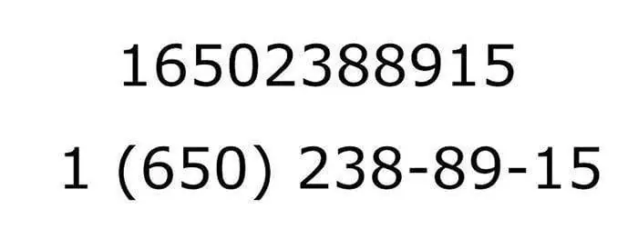
Imagine a situation where you have to keep on wondering if these two words, actions, or situations mean the same or not. I know it feels crazy, right but when the user gets confused he or she leaves the site and switches to your competitor. Do not confuse them – Keep things including your words and actions consistent. That’s what we call the “The Principle of Least Surprise.” If basically, it is the utilization of all components over your application reliably. For example, a specific style of catch for purchase presently ought to consistently do something very similar or route should work sensibly, going further into the order. Now you must be wondering what should be consistent?
- Workflow/ processes
- Functionality
- Appearance
- Terminology
Forgive easily
Your app design should be flexible enough so that even if your user wants to backtrack, he or she can easily do so. As a result, users can explore the product without the constant fear of failure. At the point when a client realizes that mistakes can be effectively fixed, this energizes investigation of new choices. One of the most common GUIs where users have the Undo/Redo option are text and graphics editors. While writing text or creating graphics, undo lets users make changes and go back step-by-step through changes that were made. Redo allows users to undo the undo, which means once they go back a few steps and can move forward through their changes again.
Undo is one such function that can help users choose system function by mistake. It’s more like the emergency exit allowing users to leave the unwanted state. For example, Gmail offers its users to undo things when someone accidentally deletes an email.
Smooth Navigation
One of the most important things to keep in mind when dealing with navigation in mobile application design is that it needs to be clear and self-evident. More and more your users must be able to enjoy as well as explore the interface of the product. A decent User Interface is said when clients will in general be in their customary range of familiarity by giving some setting of where they are, the place they have been, and where they go straightaway. Here’s the solution:
Provide visual cues – In other words, visual cues serve as reminders for end users. Likewise, clients will have the option to explore effectively through the interface by giving perspectives as they travel through an item interface. Directly from page titles to features as of now chosen route choices, and other visual guides give clients a prompt of where they are in the interface.
Predictability – Users should be provided with cues that help them predict the result of an action. A user should never be wondering, what do I need to press to do my task or what is this button for.
#2 Comfort while interacting with a product
- Eliminate all elements – Interfaces shouldn’t contain data that is immaterial or once in a while required. Superfluous data presents commotion in UI – it contends with the applicable data and decreases its relative perceivability.Strive to design UI in a way that all information presented on the screen will be valuable and relevant. Less is more is something that works here.
2. Avoid Jargon and system-oriented terms – When designing a product, it is extremely important to use language that is easy to read and understand. The framework ought to communicate in the client’s language, with words, expressions, and ideas recognizable to the client, as opposed to language or framework situated terms.
3. Design accessible interfaces – At the point when we plan items, it’s imperative to recollect that an all-around the planned item is available to clients everything being equal, incorporating the ones with low vision, visual deficiency, hearing impedances, psychological weaknesses, or engine debilitations.
Colors are one such element of an interface that has a strong impact on accessibility. Some people see a full range of colors, but many people can only make out a limited range of colors.
#3 Reduce Cognitive load
Cognitive load is the amount of mental processing power required to use a product. It’s better to avoid making users think/work too hard to use your product.
- Sequences of information or actions – This rule, in particular, can be used when organizing and grouping items together. For example, if your UI forces users to enter telephone numbers without normal spacing it can surely result in a lot of incorrectly- captured phone numbers, and maybe that’s the reason why phone numbers are broken up into smaller pieces.
2. Reduce the number of actions required to complete a task – When designing a user interface, strive to reduce the total number of actions required from a user to achieve the goal. Here, it is worth remembering the three-click rule, this suggests the user of a product should be able to find any information with no more than three mouse clicks.
3. Promoting visual clarity – Good visual organization improves usability and legibility, allowing users to quickly find the information they are looking for and use the interface more efficiently. When designing layouts:
- Avoid presenting too much information at one time on the screen. This results in visual clutter.
- Remember the principle ‘form follows function.’ Make things look like they work.
- Apply the general principles of a content organization such as grouping similar items together, numbering items, and using headings and prompt text.
It’s a Wrap!
User experience and User interface design can make or break a mobile app. There is no denying the fact that a mobile app will continue to evolve with the upgrades; interfaces of the future will be more intuitive, enticing, predictable, and forgiving, but most principles of UI design listed in this article will surely apply to them, too.
Writer note:Working as a Business Development Executive at Mobile application development Company – eTatvaSoft. Gray writes about emerging technologies and She has already written for many other blogs as well. Being a tech geek, she keeps a close watch over the industry focusing on the latest technology news and gadgets.